Course Code: DV0151EN
Audience: Anyone
Course Level: Intermediate
Time to Complete: 5 hours
Language: English
“A picture is worth a thousand words.”
We are all familiar with this expression. It specifically applies to explaining the insights obtained from analyses of increasingly large data sets. Data visualization plays an essential role in the representation of both small-scale and large-scale data.
The ability to narrate a compelling story by visualizing data and findings in a stimulating way is one of the key skills of a data scientist. Learning to use a software tool to visualize data would enable you to extract information, understand the data better and make more effective decisions.
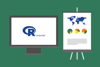
The main goal of ‘Data Visualization with Python’ is to equip you with the skills to turn data, which appears to have little meaning, into forms that explore its various nuances. Different techniques have been developed to present data visually. In this course, we will be using the open source language R.

Saeed Aghabozorgi, PhD. He is a Sr. Data Scientist at IBM with a track record of developing enterprise-level applications that substantially increase clients’ ability to turn data into actionable knowledge. He is a data mining field researcher and expert in developing advanced analytic methods like machine learning and statistical modelling on large datasets.

Polong Lin is a Data Scientist and Lead Data Science Advocate at IBM in Canada. Polong co-organizes the largest data science meetup group in Canada, and regularly speaks at conferences about data science. Polong holds a M.Sc. in Cognitive Psychology.
Thanks to BDU course developement team, BDU interns and all individuals contributed to the development of this course: João Henrique Rezende, Helly Patel , Mandeep Kaur , Hiten Patel , Marta Aghili , Anita Vincent , Iqbal Singh , Rishabh jain ,Aditya Walia , Kumar Gaurav