Tableau is a leading business intelligence tool that has garnered the attention of many with its sauve and easy to use interface. While it maintains an excellent level of efficiency, it cleverly steers clear of the corresponding complexity.
In this tutorial, we will discuss Tableau and how you can use it to visualize business data. We will also compare and contrast Tableau with some other tools available (in the same bracket)
Content:
- Introduction to Tableau
- Why should you use it?
- Tableau and You
- Tableau and the top three DV tools
- The Tableau Products
- Getting Familiar with Tableau
- The Tableau Architecture
- Using Tableau
- Step 1: Installing and Setting up your Tableau UI
- Step 2: Connecting to Data
- Step 3: Exploring the Tableau UI
- Step 4: Visualizing data in Tableau
- Step 5: Communicate and Compete
- Endnote
Introduction To Tableau:
Today, information is the most important asset an organization has. From usage in decision making to training intelligence systems, information is shaping the world.
However, raw information is not always usable. To have the numbers tell their story in a way that a layman can understand it, is the job of Data visualization. Making commercial use of information comes under business intelligence.
Now, when we talk about data visualization and deriving business intelligence from it, the first tool that comes to mind is Tableau.
Why Should you use Tableau?
- Tableau supports most types of databases
File based data, relational database data sources, OLAP data sources, Cloud based data sources, you name the database and Tableau supports it. Connecting a database to Tableau is easy and you can have your pick between a live connection, in-memory connection or local DB connection. As discussed in Tableau architecture, in live connection, changes in the database are reflected in the visualization in real time.
- Tableau integrates with R and Python + Interactive Analysis
Tableau doesn’t aim at replacing R and Python, it integrates with them.
While working with R and Python you need to have a very specific vision of what are you expecting in the answer and how you wish to format it. Whereas, Tableau offers you the flexibility of interactive analysis i.e. you can reformulate your question with each new answer that emerges from a visualization.
R and Python could be used to clean and model the data while in collaboration with Tableau, interactive analysis will allow you to explore the data better.
- Easy and fast Visual dashboards
Creating visualizations and data models is a cakewalk with Tableau. You can choose from multiple graph options, color themes, fonts and data conjoining options to create the visualization as per your requirements.
From data discovery and self-service business intelligence to simple statistical analytics like trends and forecasting, Tableau does all and with innate grace.
- Maximum Database leverage
Tableau supports heterogeneous database support and live-connectivity. You can choose to keep your data on-premise, off premise at the Tableau Server or at the third-party Tableau collaborator server as the need be.
Changes performed in the visualizations are reflected back into the database and vice versa. For systems which might not have a native database connector, Tableau offers ODBC connector also.
- No Coding required
Tableau requires you to do next to no coding. To analyze data and to create graphs, you just need to drag and drop the desired fields onto the worksheet area (discussed further in the article). Tableau does integrate well with R/Python, but doesn’t provide intrinsic support for either. All the operations performed are translated into VizQL queries by the software itself and the corresponding results are displayed as visualizations directly.
- The Tableau Community
The Tableau community is enormous and provides valuable support for those trying to learn the niche of this tool. Tips and tricks, demo projects to model practices, everything is out there for a practitioner and more if you dig deeper.
A strong community is important for a tool because it signifies how many are using the software and how long is it going to be in use. With a strong community and user base, Tableau’s reliability goes up and the organization itself works harder to maintain the positive brand image.
- Tailor-made for your organization’s needs
Tableau offers custom made package also for large organizations or organizations that feel that the current products are a little mismatched for their needs and requirements. You could contact Tableau directly and explain your requirements and have your perfect package!
Tableau and You
By now, we are all clear about how important is Tableau for various organizations and people, what are its pros and cons, its abilities and its limitations and how to work your way around it.
Now, let’s discuss how can Tableau help you in your career.
Medium to large sized organizations, Data Scientists, Data Analysts, Marketing Managers, general employee, almost anyone can use Tableau to visualize their data.
For Organizations: Tableau is most suitable for medium to large sized organizations which need a product to create visualizations and analyze data. However, smaller organizations which use Tableau Desktop, will ne be able to use the product online until they get Tableau Server, which can prove quite expensive.
For Data Scientists & Data Analysts: For these expert professions, Tableau can be used in conjunction with R/Python as it allow integration but doesn’t have the ability to process data like these programming languages do. The major use case of Tableau for a data analyst or a data scientist would be to create visualizations that non-technical people can understand. For presentations like events where managements needs to the story of the data, Tableau is a handy tool to create beautiful and powerful visualizations.
For Marketing Managers: Visualizing data is an important part of the decision-making process. Segmenting customers, assigning proper product campaigns, knowing the correct trends and being able to convey the information efficiently to teams working on the ground, are all the phases where Tableau comes in handy.
Apart from these, a regular person may use Tableau to visualize his office statistics, a teacher might use it to make teaching more interesting and intuitive, a student might use it to simply keep a graphic record of her progress! The uses are as many as you can imagine. The simplicity this tool has brought to data visualization, has brought it in reach of the most naive.
Tableau and the Top three
The top three tools used for data visualization today are Tableau, QlikView and Domo.
| #1 Tableau | #2 QlikView | #3 Domo | |
| The Good | - Efficient and robust data visualization options and tools. (Even a novice can use Tableau efficiently)- Easy and minimalistic UI, well-placed and well-equipped tool bar | Efficient search protocol for searching data,Can combine data sources,Eliminates dependence on IT. | - Efficient at connecting data using hundreds of connectors;- Single platform data access and reporting;- Customized solutions,Full functionality, open, self-service business cloud to support all DV needs of an organization |
| The Bad | Steep learning curve for executives, Expensive for a small enterprise, | Non-technical users might find it difficult to | Expensive for a small business, Difficult data extraction system,No on-premise development |
| The Bottom Line | Tableau offers intuitive business development tools to enhance data discovery and understanding | Qlik’s in-memory processor speeds up data processing and provides a live connection with the database (changes in the database are updated in the visualization as they happen) | Business development platform for all who want to make better business decisions |
| Unique Features | Intuitive BI tools to enhance data discovery, | Inference Engine which automatically maintains data associations, | ‘World’s first Business Management Platform’ on cloud. |
| Pricing | Tableau Desktop consists of a Personal package that costs $35/user per month and a Professional package that is priced at $70/user per year. Tableau Online costs $42/user per month, whereas the Tableau Server is priced at $35/user per month with a 10 user minimum. | Personal Edition is free while for the Enterprise edition, one needs to contact QlikView directly for a quote. | $175 per user per month (annual billing). It covers unlimited data capacity, 400+ data source connectors, cloud and on-premise deployment and email/phone support, etc. For Enterprise plan one could contact Domo directly for a price quote. |
The Tableau Products:

- Tableau Desktop: It is the simplest of Tableau product and still is a quite powerful tool that anyone can use for visualizing their data. It comes in two variants: Tableau Desktop Personal and Tableau Desktop Professional.
- Tableau Desktop Personal: This version comes with all the tools Tableau Desktop offers and the workbooks are stored in your computer or the public cloud, whichever you choose. However, it provides limited options in term of connection support (uploads Excel, text files, Access, statistical files, and Tableau files only) and sharing. It is more suitable for people who will be using flat files (excel and text files) and need a cost-effective solution for a more private storage than Tableau Public.
- Tableau Desktop Professional: It is similar to the Personal version but it supports a wider variety of connectivity options (all possible formats) and allows more diverse sharing options. You can save your files on your computer, the Tableau Server or the Tableau cloud. It is recommended for people who will be using heterogeneous databases and will need to store data at Tableau Server.
- Tableau Server: The Tableau Serve is like a central repository of all your workbooks. Any of your clients or partners. With whom you have shared the link, may access a workbook in this space via a web browser. That is, to access a file, it should be uploaded at the Tableau Server and you must have the permission to access it.
Any changes made in the workbook through Tableau Desktop, wil be kept and refreshed at all other locations automatically (wherever you have preferred a live-connection).
You will however need to buy an additional user license to use Tableau Server, even if you have Tableau Desktop Professional.
It is suitable for those who need to make their workbooks accessible in the cloud, also privately.
- Tableau Online: It is similar to Tableau Server but a third-party collaborator of Tableau hosts it. It provides you with cloud storage benefits like distribution, sharing and automatic refreshing, however the data is stored off-premise which may bring in some security consideration for certain organizations.
Also, it requires per-user licensing even when those users have Tableau Desktop. It is however, more cost-effective than Tableau Server.
Hence, Tableau Online is suitable for people and organizations which are comfortable with having their data stored offline and require the cloud benefits.
- Tableau Reader: The Tableau Reader allows you to open and analyze ‘Packages Workbooks’. Packages Workbooks are files prepared by Tableau that contain the data alongside the visualizations. However, you can only view the workbook using a Reader, very much like viewing a pdf file using a pdf-reader.
- Tableau Public: This product is free to use and offers the full-fledged Tableau arsenal for analyzing and visualizing your data. However, all the workbooks hence created are saved on the Tableau cloud, which is a public space. This public access makes it a non-option to business organizations. Also, it provides connectivity to text and excel files only.
Which Tableau Products is good for me?
While deciding which product is best for you, you need to ask yourself a few questions:
- Connectivity: Which data sources are you going to use?
- Distribution: Who can see your dashboards and how will you be sharing it with them?
- Automation: Do you need your visualizations to update automatically on a refresh schedule?
- Security: Would you prefer on-premise data storage or your data can be stored on the cloud? (Data is publically shared on cloud)
Having garnered the answers for these questions, you can easily pick the best Tableau solution for your requirements.
Getting Familiar with Tableau:
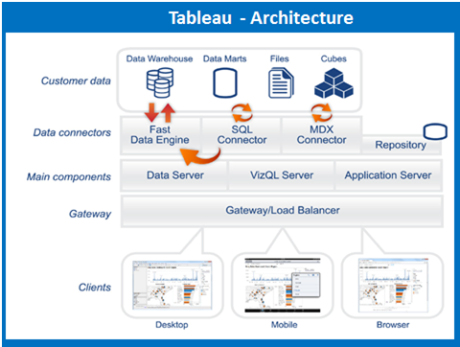
The Tableau Architecture:
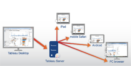
Tableau boasts of a highly scalable, n-tier, client-server architecture which serves web clients, mobile clients, desktop-installed software clients.

The following image sheds light on the architecture of Tableau Server.

Now, you will read about the components of the Tableau architecture:
1.1 Data Layer:
Most organizations have a heterogeneous database that is, the database consists of various types of files instead of being in one format at one single location. Relational databases, data warehouses, cubes, flat files like excel spreadsheets, text files etc coexist in an organizational data environment.
Tableau enables you to load only the files that you need and automatically generates visualizations as you go. It also allows you to organize your data better to make it faster and more responsive, generally by employing the in-memory data engine, Hyper.
1.2 Data Connectors
Tableau offers hundreds of data connectors to correlate data and generate intuitive and interactive visualizations. For systems which do not have native data bridges, Tableau
has ODBC connectors. It can be accessed in two modes:
1.2.1 Live Connections
During a live connection, changes in database are reflected in the visualizations in real time. To perform this, Tableau transfers the SQL or MDX statements directly to the database instead of importing all the data.
However, live connections are more beneficial when used with organized databases like Vertica as these databases retain the comprehensive data and send only the query aggregate to Tableau which makes the process even quicker.
1.2.2 In-Memory
During an in-memory setting, the database or the selected part of the database is uploaded at Tableau and the in-memory data engine, Hyper processes it. It is a fast and easy process, and requires no intervention from you. Once you have loaded the database/part of database, you can begin visualizing and interacting with the data.
Hyper
Hyper is the data engine technology that tableau uses. This engine possesses dynamic code generation abilities in combination with advanced parallelism techniques to achieve fast performance for extract creation and query execution.
- Hyper reduces stale data and minimizes connection gap between specialised systems by processing transactions and analytical queries on the same column store, with no post processing needed. This means that you can have fast extract creation, without having to sacrifice speed of query execution.
- Unlike many other systems which use the traditional query model, Hyper uses a just-in-time compilation execution model. This model is better equipped to make judicious and efficient use of your modern multi-core computing hardware.
- Also, Hyper employs an improved parallelism technique which allows it to allocate morsels (very small units of work) efficiently to all available cores. This allows Hyper to more efficiently account for different core speeds.
VizQL
VizQL is the visual query language that translates your actions into a database query and then expresses the results graphically. VizQL is the sole credit holder for making visualizations this easy even for people who are not analysts. With little or no training, anyone can see and understand the story a data set has to tell.
As put aptly by Turing Award winner Jim Gary, “If you have ever been frustrated when trying to plot a useful graph from a simple spreadsheet, you would appreciate the value of a system that allows users to create stunning graphs interactively and easily from large multidimensional datasets.”
Using Tableau
For this portion of the tutorial, we will use Tableau Desktop.
The free personal version of Tableau Desktop can be downloaded from here. It will come with a fourteen day trial offer after which you will need to buy it. During the trial period, the full toolset of the software is usable. On expiry of the 14-day trial, however, you will need to buy an activation key to keep using the software.
However, you could also use the Tableau student version which is free for one year but has limited functionality. If you are a student and need Tableau for your curricular or extracurricular usage, it is a decent option.
Step 1: Installing and Setting up your Tableau
Launch the installation Wizard
Once you have selected the version of Tableau suitable for your computer and operating system,
Once you have downloaded the installation package, run the executable file.

You should see the installation wizard as shown in the figure. Click on ‘Run’ on this screen. You will need administrative permissions to install the software on your system. (It is a security feature of the Operating system, not the software)
Accept the License Agreement
This screen appears after clicking on ‘Run’. To proceed, you will need to check the checkbox affirming you have read and agreed to the terms and conditions of the software.

Once you check this box, the installation begins. This doesn’t require your intervention till the installation completes.
Start Trial or Activate Tableau
Once the installation completes, you should see this screen.

- If you have a purchased a key then click on ‘Activate’ and enter the key on the next screen.
- If you wish to run trial period first before you invest in Tableau (which we recommend), go for the ‘Start Trial Now’ option.
- If you wish to use the software at a later point, click on ‘Start Trial Later’. This will set your trial beginning date when you use the software for the first time.
For the purpose of this article, we have selected ‘Start Trial Now’.
Enter your details
Once you choose ‘Start Trial Now’, the following screen pops up:

This is the user registration interface and here, you will input your personal details and click on ‘Register’. Once you have registered, you trial period begins and the installation is complete. Once you click on register, the following screen appears:

Click on ‘Continue’.
Verify the Installation
To verify the installation, you can open the program list from the ‘Start’ icon of your OS and select Tableau from the list of programs. It should launch right away and you should see the following screen:

Step 2: Getting Started with Tableau
Before we get to operating on the software, it is imperative that you understand the data flow of Tableau. All the upcoming steps are parts of this data flow.

To put Tableau to use, you will:
- Connect to a data Source
- Choose Dimensions and Measures
- Apply Visualization Techniques
Connecting to a Data Source:
Tableau connects to all popular data sources like:
| Tableau Server | Google Analytics |
| Hortonworks | Hadoop Hive |
| Google BigQuery | MapR Hadoop Hive |
| IBM DB2 | IBM BigInsights |
| IBM Netezza | Microsoft SQL Server |
| Microsoft Analysis Services | Oracle, Oracle Essbase |
| MySQL , PostgreSQL | SAP |
You can connect with local as well as remote databases. You have the choice of setting a live connection (as explained in Tableau Architecture) with which all changes in the database are reflected in you visualizations in real-time or upload the database at Tableau itself.
On the first screen that you should see is(as soon as you launch the software), look at the left side, at this menu:

From this menu, choose the format and location of the file and it should take you to the following screen:

- If you choose the ‘Connect Live’ option, along with real time updation of visualizations, all the changes that you make will also be reflected in the database.
- If you choose ‘Import All Data’, the complete database will be uploaded to Tableau which will keep changes from happening in the real database.
- When you choose ‘Import Some Data’, the selected part of the database is uploaded to Tableau and all changes made are not reflected in the source database.
Step 3: Exploring Tableau:
Data Types in Tableau:
Once data is loaded, Tableau automatically assign data types. You can change the data type of a field as the need be as long as it satisfies the data conversion rule.
The data types used by Tableau arre:
- String: any sequence of zero or more characters will be classified under String data type. They are enclosed within single quotes. To include quote itself, it needs to be written twice. Example: Academy.
- Number: Whole numbers and decimal numbers come under this criteria. It is, however, recommended that you convert or round off decimal number/floating point numbers before using them in calculations. Example: 345, 123.34.
- Boolean: Logical Values like True and False are classified as Boolean in Tableau.
- Date and Time: Tableau generally recognizes dates in almost all formats. However, if you need to force Tableau to recognize a data field as Date, all you need to do is just a ‘#’ in its beginning.
The data types in tableau can be categorized as:
- Measures
- Dimensions
A dimension is a field with an independent variable and is usually text. A measure is a dependent variable field and is usually dependent on one or more dimensions. A measure is generally a number. The main job of a dimension is usually to add more detail to describe your data.
Data Joins:
Data joins allow you to correlate data and understand the relationship among different datasets better. Tableau supports four types of data joins: Left Join, Right Join, Inner Join, and Full Outer Join.

The image above sheds light on the concept behind each of the available join options in Tableau.
The Tableau UI Intricacies:
- The Menu Bar

(Source: https://www.edureka.co/blog/tableau-tutorial/)
The screenshot above is the menu bar you’ll see in the newer versions of Tableau.
- File Menu:
This tab is used to create new workbooks both in the Desktop and the Server versions of Tableau. Major features under this tab are:
- Workbook Locale: to set the language to be used in the report.
- Paste Sheets: to paste a sheet into the current workbook which is copied from another workbook.
- Export Packaged Workbook: this option is used to create a packaged workbook which will be shared with other users.
- Data Menu
To import a new data source or to upgrade the existing data source, this tab is where we find our options.
Major options available under this tab are:
i. New Data Source to see all available connections and choose from it.
ii. Refresh All Extracts to refresh the data from database.
iii. Edit Relationships option is used to define the fields in case we are using heterogeneous data sources.
- Worksheet Menu
This tab directs us on our way to create a new worksheet, letting us customize features like the title of the worksheet, the captions etc.
Major options in this tab are:
i. Show summary displays the summary of the data used in the worksheet like the count etc..
ii. Tooltip to show the tooltip when the pointer is hovering above various data fields.
iii. Run Update is used to update the worksheet data or filters used.
- Dashboard Menu
This tab is used for creating a new dashboard and displaying features like the title, exporting images etc.
Major features in this menu are:
i. Format: to set the layout in terms of colours and sections of the dashboard.
ii. Actions: to link the dashboard sheets to external URLS or other sheets.
iii. Export Image: to export an image from the Dashboard.
- Story Menu
This Menu is used to create a new story which has many sheets or dashboards with related data.
- Analysis Menu
All the major action needed for analyzing data are available under this tab. Tableau also offer some handy features like calculating percentage, performing a forecast etc.
The important features in this menu are as follows:
- Forecast to display a forecast based on available data.
- Trend Lines to create the trend line for a series of data.
- Create calculated Field to create additional fields based on certain calculation on existing fields.
- Map Menu
This Menu is used for building map views in Tableau. You can assign geographic roles to fields in your data.
The important features in this menu are as follows:
- Map Layers to hide and show map layers, such as street names and country borders, and add data layers.
- Geocoding to create new geographic roles and assign them to the geographic fields in your data.
- Format Menu
Tableau is all about beautiful and robust visualization. Format tab provides you with extensive options to format and customize your text, images and graphs including color combinations.
The important features in this menu are as follows:
- Borders to apply borders to fields displayed in the report.
- Title and caption to assign a Title and caption to the reports.
- Cell Size to customize the size of the cells displaying the data.
- Workbook Theme to apply theme to the entire workbook.
- Server
To access the Tableau server, you’ll be clicking on the ‘Server’ tab.
The important features in this menu are as follows:
- Publish Workbook to publish the workbook in the server to be used by others.
- Publish Data source to publish the source data used in the workbook.
- Create User filters to create filters on the worksheet to be applied by various users when the access the report.
- The Create Visualizations/ Show Me (Older versions) Pane
The following table lists most suitable graph options for different situations. These are discussed in detail further in the article.

Step 4: Visualizing data in Tableau
Choose Dimensions and Measures
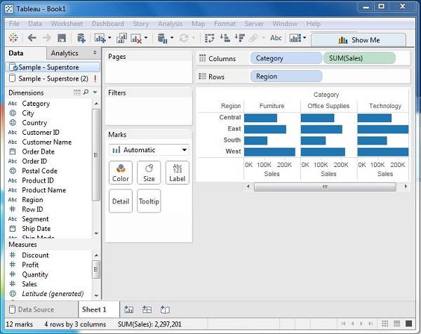
The user interface of Tableau is applauded for being no-nonsense and easy to access. In efforts of keeping it from looking complex, some more important features have been put in various drop-down menus. One might have to explore the UI a bit to access these. The following figure shows the standard Tableau Desktop UI.
Once you have uploaded your data source, the column names are visible in form of a list in the left hand side pane of Tableau UI.
As mentioned earlier, measures are numeric data while dimensions are descriptive data. Measures are dependent on one or more dimensions.
The following image displays how a sample project is represented in the UI and the blue arrow indicates the dragging of ‘Order’ to the workspace.

The following figure depicts how chosen measures and dimensions stack and can be turned into a visualization:

Here, we have chosen ‘Sales’ as the measure and ‘Category’ and ‘Region’ as the dimensions. In simpler words, Sales is the variable numeric field dependent on the independent descriptive fields ‘Category’ and ‘Region’.
Applying Visualization Tools:
In the previous screenshot, you will see a simple spreadsheet representation of the data we have from our sample database. Now, let’s take it up a notch.
Drag and drop the ‘sum (sales)’ column from the ‘Marks’ tab to the Columns shelf. The spreadsheet like table will now turn into a bar chart, automatically.

As we keep adding dimensions to the data, the number of colors and the data representation will update accordingly. Consider this scenario:

The newer version of Tableau has a cleaner interface while looks like this:

The right hand side pane of this window clearly shows the number of representation options you have. You can choose any of these and figure out which makes your data looks most understandable and appealing. The following figure zooms in on the right hand side pane graph menu:

Some of the most common visualizations used in Tableau are:


Step 5: Communicate and Compete
Once you have learnt your way around Tableau, you could go online and fine tune your proficiency by trying your hand on some of the demo projects available online. There are multiple Tableau forums and groups which discuss a slew of topics related to Tableau.
These communities also help you stay updated with the latest changes and upgrades in Tableau and master the skills thus emerging.
With enough practice, you’ll become a Tableau Ninja, ready to never miss the bliss point of data visualization!
Endnote
We hope the blog was informative and helped you understand what tableau is, how does it function and why is it important. If you have any queries or doubts, let us know in the comments. Keep Visualizing!